An ecommerce site structure should help a buyer move from a recognizable need to a relevant product and then to purchase. Organize categories around meaningful choices, connect every important product through links, and use guides to answer questions that product pages cannot handle well on their own.
Turn a marketplace catalog into useful website journeys
Etsy sections and listing titles are inputs, not a finished owned-store navigation plan. Group products around how buyers choose: intended use, product type and meaningful attributes. Avoid generating a category for every keyword variation if the resulting page has little distinct value.
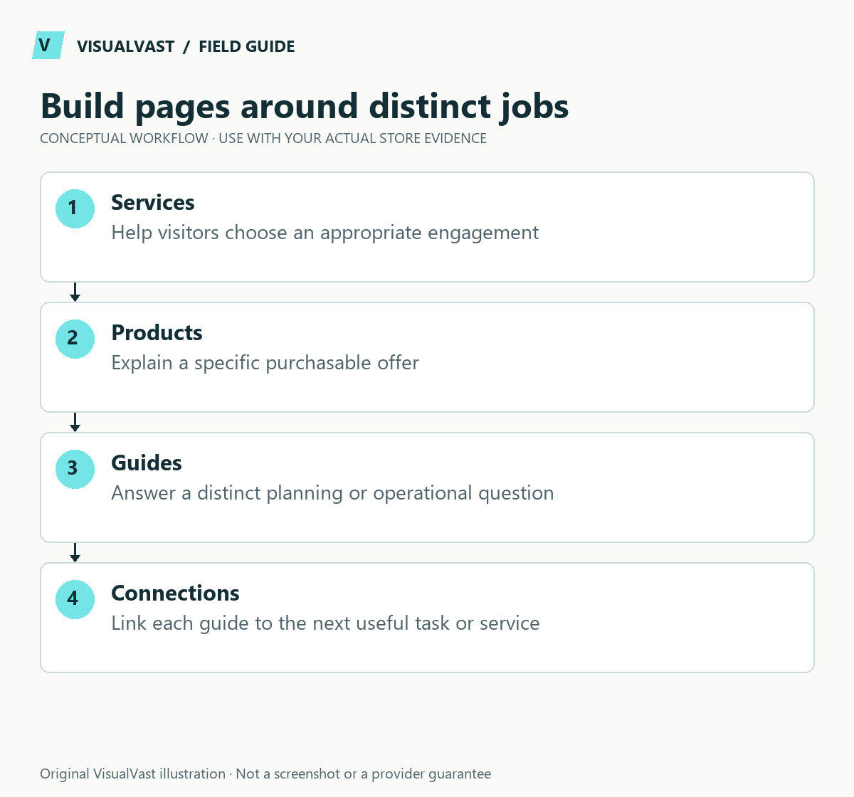
Use a three-level planning map: a useful collection, a specific product, and a guide that answers a decision question. A printable collection might link to format/compatibility guidance; a wall-print collection might link to a size guide. The guide should link back to the relevant collection or service at the point where it helps.
For this VisualVast library, the operational clusters are planning, migration, POD/multichannel, digital delivery and store care. Each troubleshooting article links to its setup guide and next diagnostic step. Use the same-description guidance to decide where channel-specific copy adds value, and the migration checklist to protect existing valuable addresses.
Google explains that page relationships and navigation links help it understand an ecommerce site. Its recommended pattern connects menus, categories, subcategories and products through crawlable links. See Google’s ecommerce structure guidance. Search usability begins with a structure people can also understand.
Give each page type a distinct job
Use this guide’s worksheet in the fillable workbook (PDF, page 18). Download and save a copy to retain your entries.
Download: URL migration and smoke-test ledger (CSV)
| Page type | Primary job | Avoid |
|---|---|---|
| Homepage | Explain the store and provide useful entry points | Listing every product and every keyword |
| Category | Help buyers compare a coherent group | Empty or overlapping collections |
| Product | Explain one purchasable offer | Generic copy that hides important differences |
| Guide | Resolve a planning or usage question | A long article that never helps the reader decide |
| Support page | Explain delivery, use or problem resolution | Marketing language where a clear instruction is needed |
Write the main question each page answers before deciding the menu labels. Two pages with the same job may compete for attention and create maintenance work without helping the buyer.
Start from the catalog and customer language
Group products by how customers choose them. Depending on the range, that could mean purpose, product type, recipient or a meaningful specification. Avoid exposing an internal supplier taxonomy if buyers would not understand it.
For a fictional digital shop, “Lesson Planning,” “Appointment Tracking” and “Business Worksheets” could be useful only if there are real products and distinct needs behind each group. Creating many thin categories before the catalog exists makes the site harder to navigate, not more authoritative.
Draw the path to every important product
Create a simple inventory with page title, URL, parent category and incoming links. Check that a visitor can reach a product without using the search box. For a large catalog, review pagination and filtering so important content is not available only after a script-driven interaction.
Use short, descriptive URLs where practical, but do not change established addresses casually. Google’s ecommerce URL guidance explains why consistent URL design matters. If you are redesigning an existing site, build a migration map before altering its structure.
Connect guides to useful next steps
A guide should link to the category or service that naturally follows the decision, plus a small number of related resources. A digital product compatibility guide can lead to the relevant product family. A readiness checklist can lead to an audit. Avoid adding every service link to every paragraph.
For VisualVast, the editorial path is deliberate: readiness leads to a scoped decision, implementation guides explain delivery risks, and traffic planning addresses the work after launch. Each guide should earn its place by answering a distinct question.
Test the structure with real tasks
Ask someone unfamiliar with the site to find a specific product, compare two options and locate delivery information. Observe the path without explaining the menu. Record where they choose the wrong category or backtrack.
- Are menu names understandable without specialist vocabulary?
- Do category pages explain the differences among products?
- Can the buyer reach essential support details from the product page?
- Are links descriptive enough to predict the destination?
- Does the same path remain usable on a phone?
Use those observations to simplify the structure. More navigation links do not automatically create better discovery.
Common questions
How many categories should I create?
Enough to organize meaningful choices in the actual catalog. There is no useful universal count. Start with distinct groups and expand only when the range and customer behavior justify it.
Should every keyword have its own page?
No. Closely related wording can belong on one useful page. Create a separate destination when the user’s task or offer is genuinely different.
If you need a coherent structure for a launch or redesign, explore SEO & Traffic Foundations and preserve valuable existing URLs through the migration checklist.